




Challenge
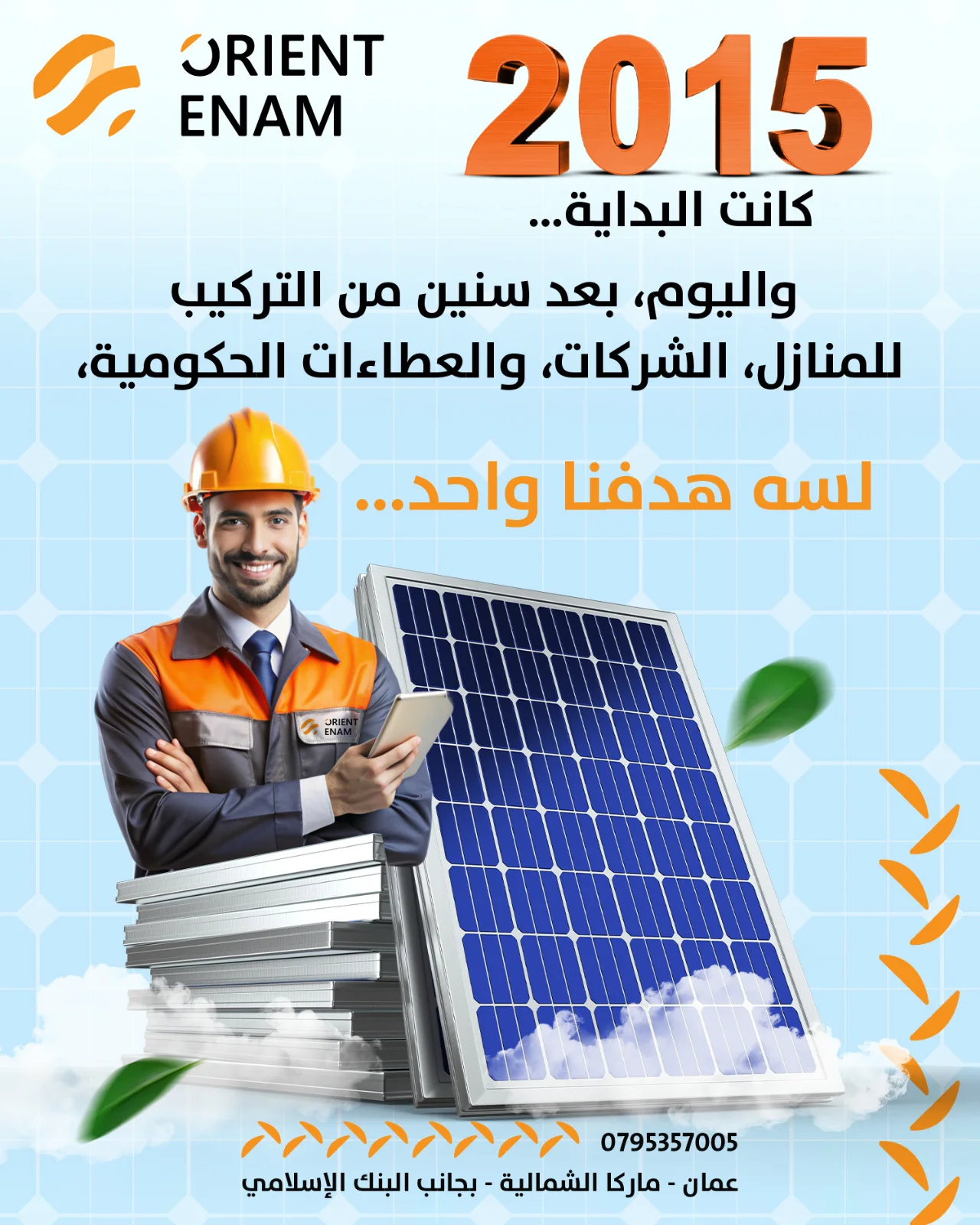
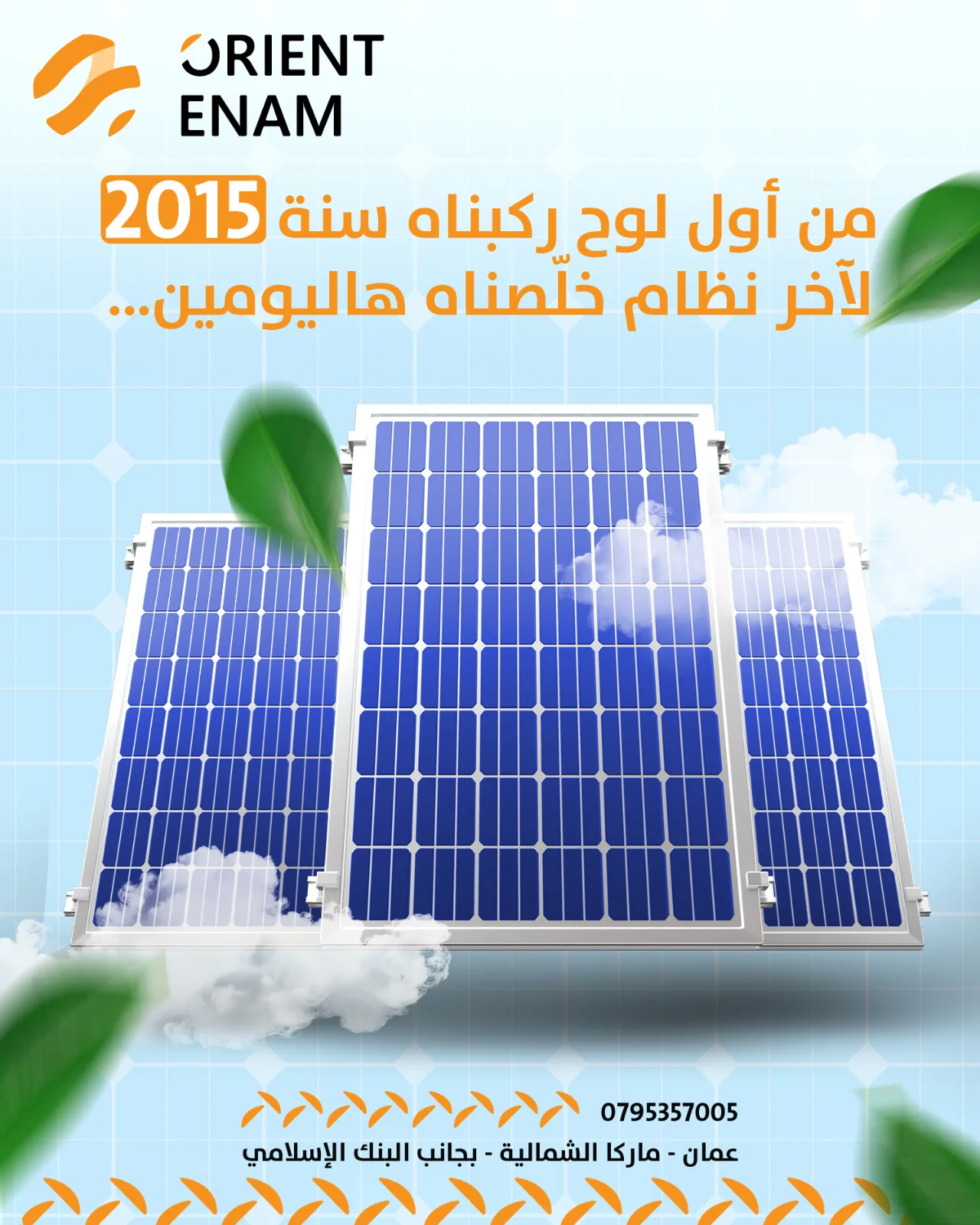
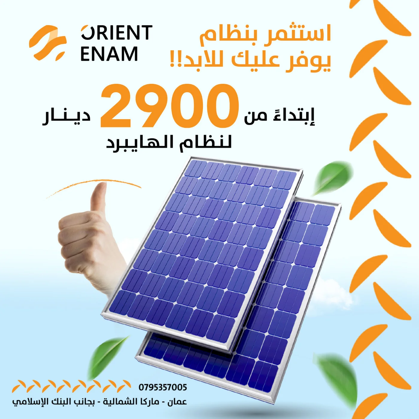
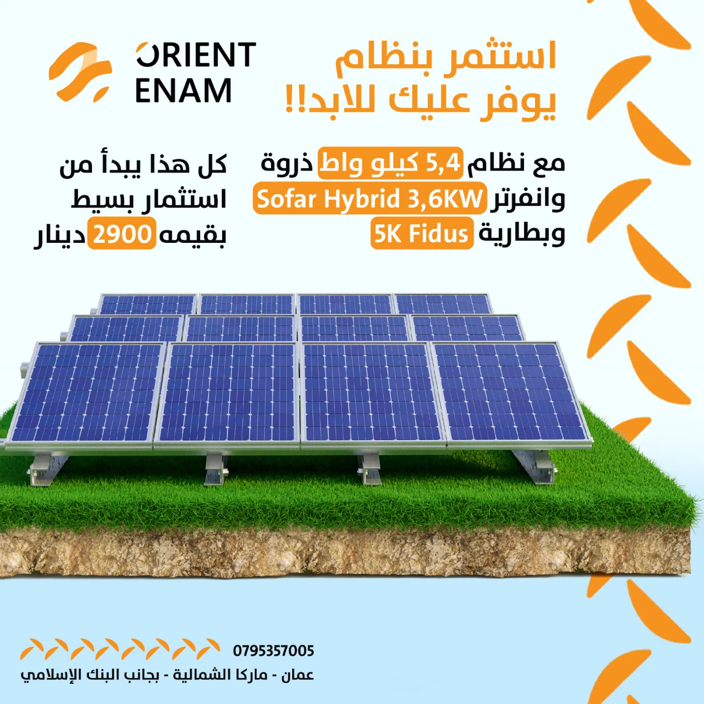
A solar company operating since 2015. Installations in homes, wins in government tenders, but a visual identity that made them look like a small workshop. Worse: the market was full of misconceptions about solar that killed deals before they started. People were not rejecting the price. They were rejecting an idea they had not understood.
Approach
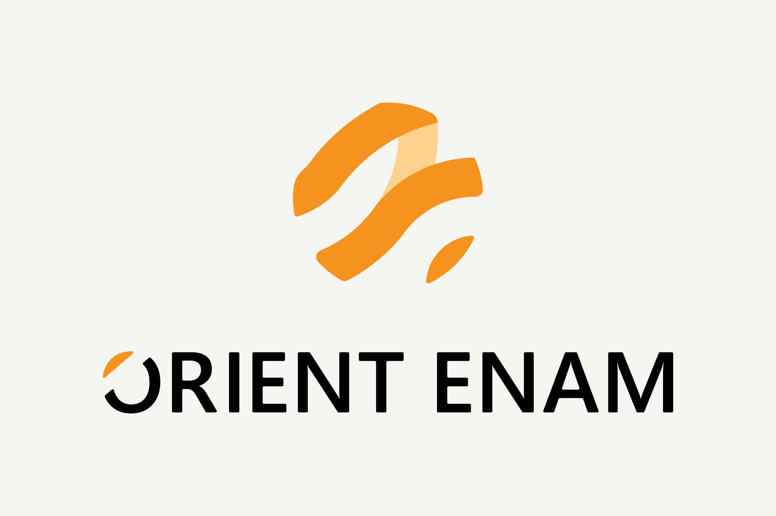
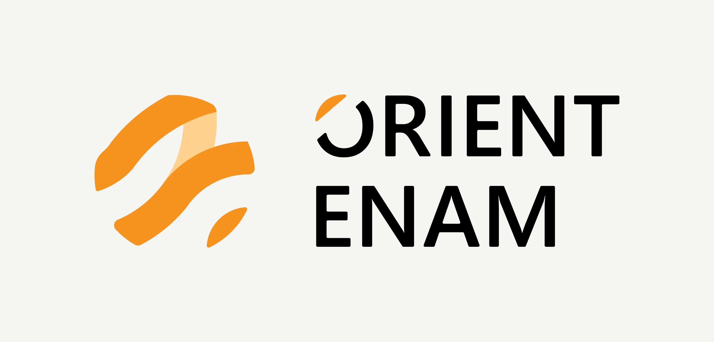
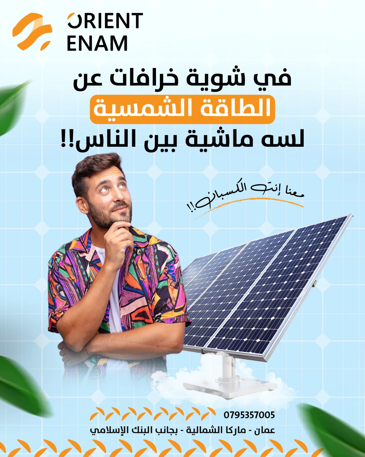
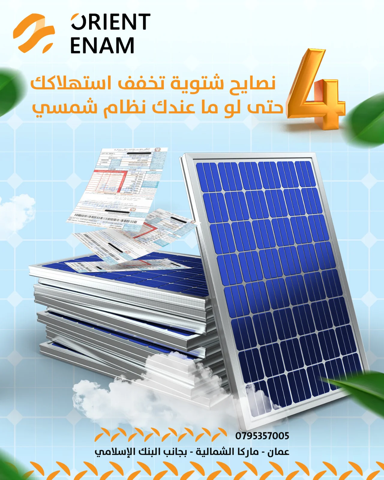
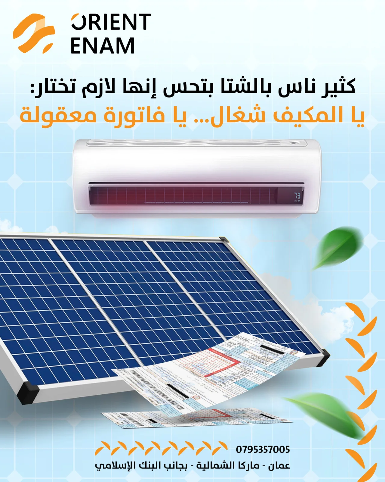
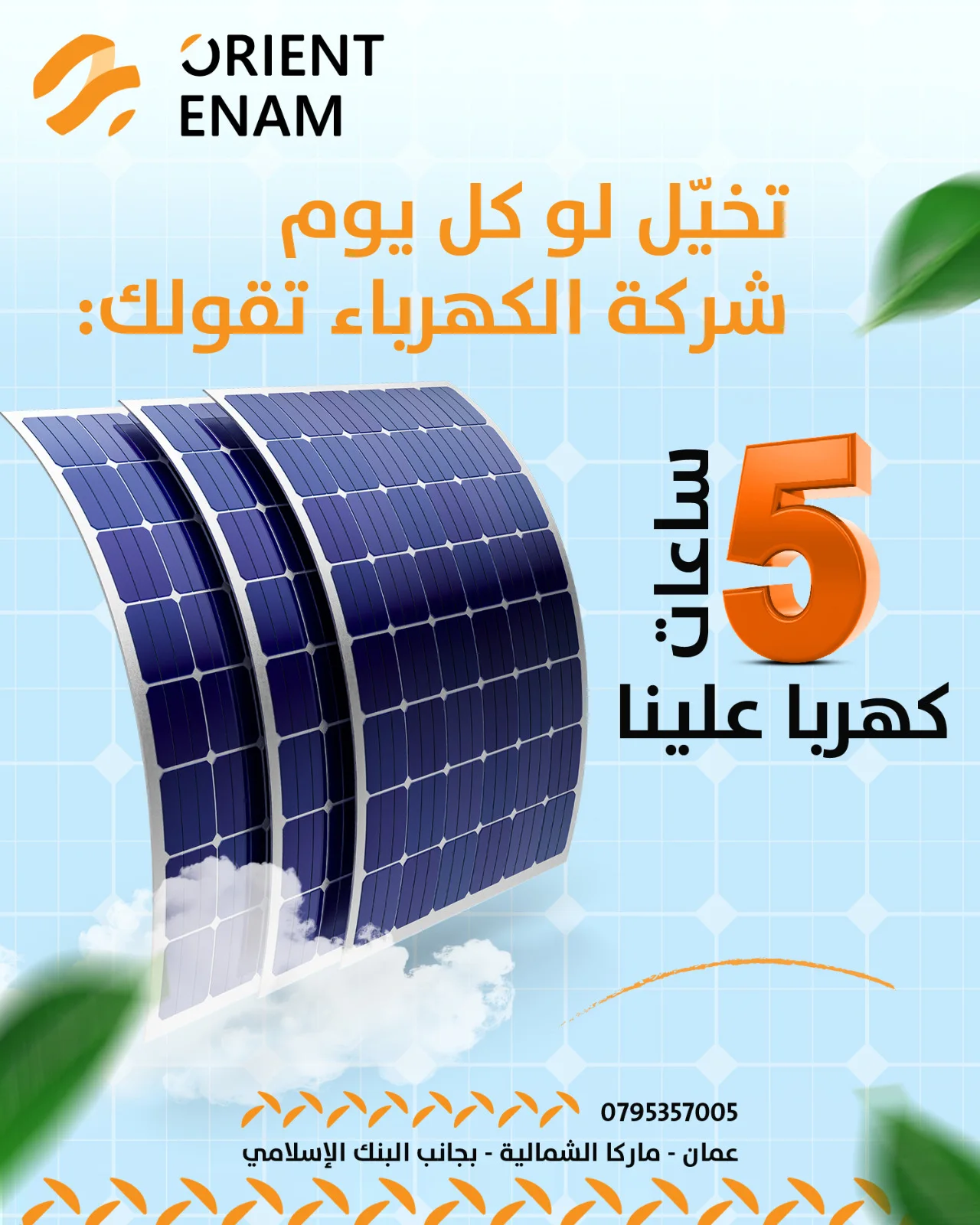
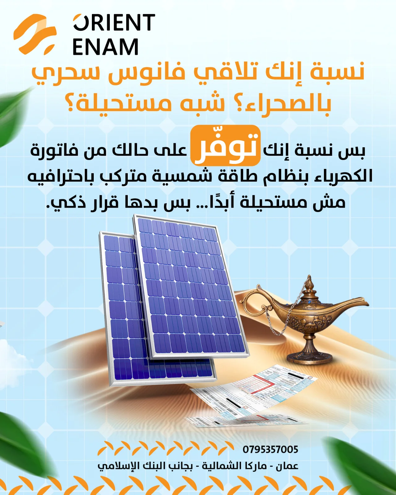
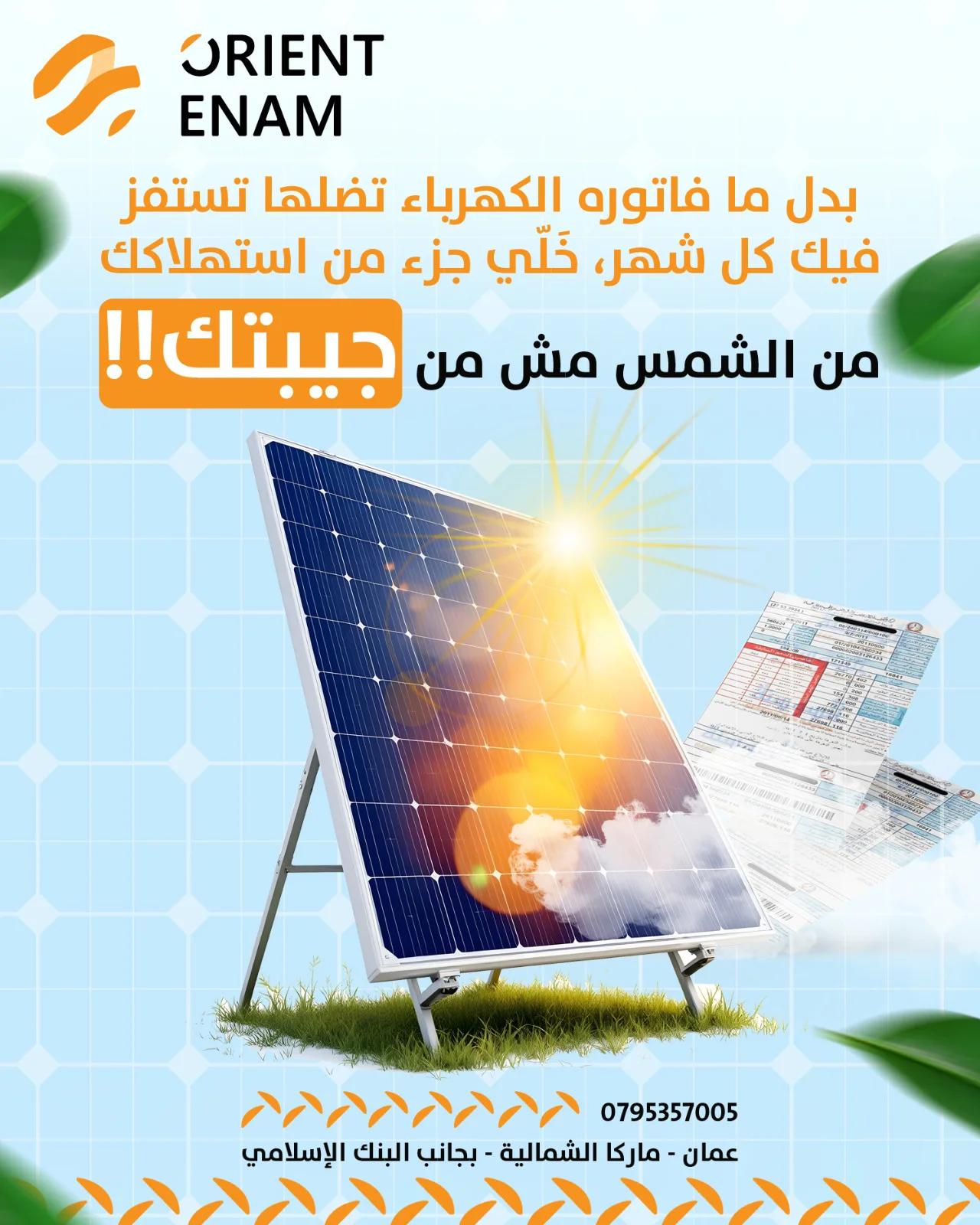
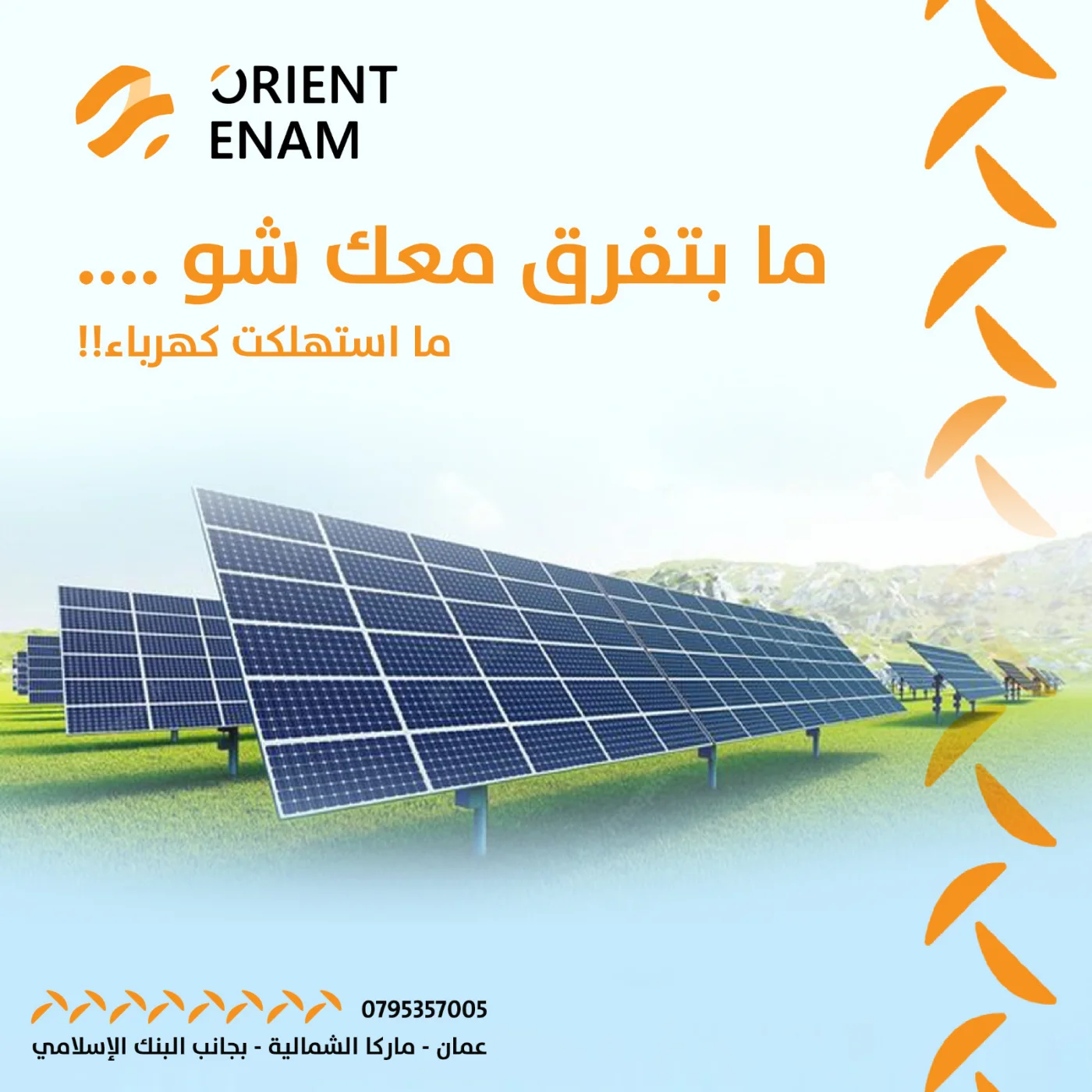
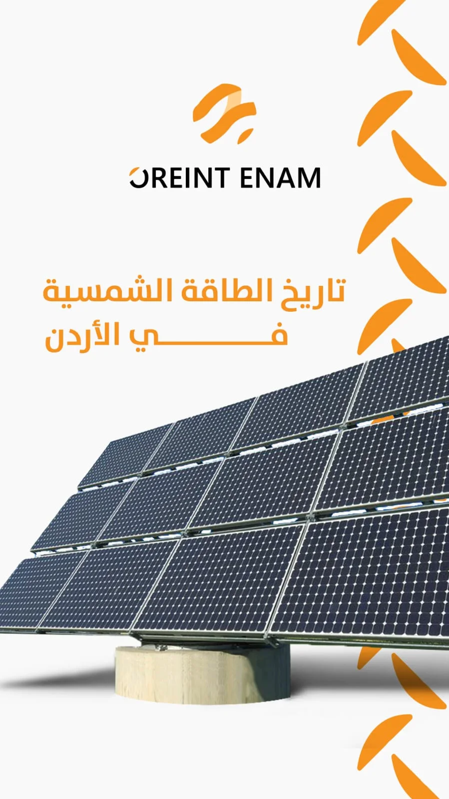
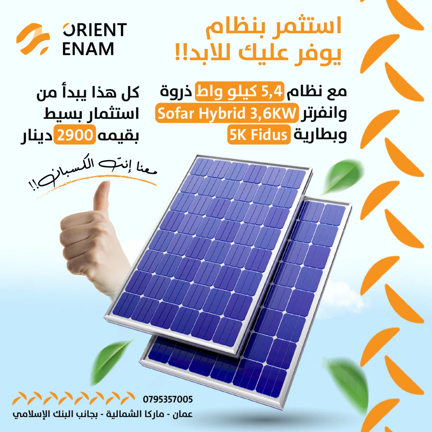
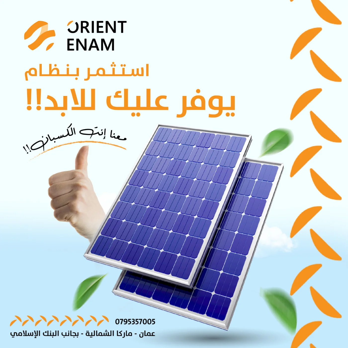
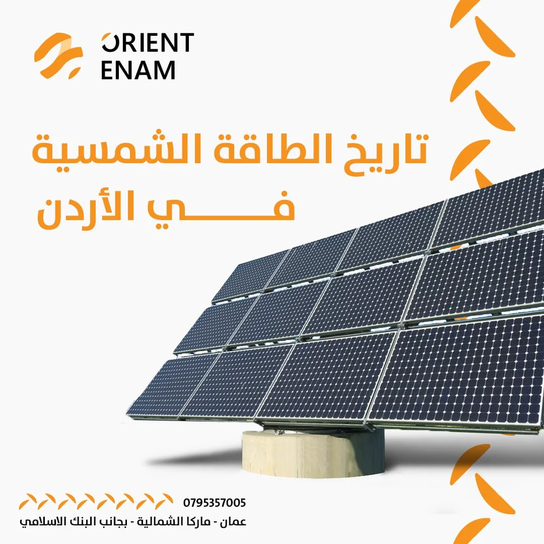
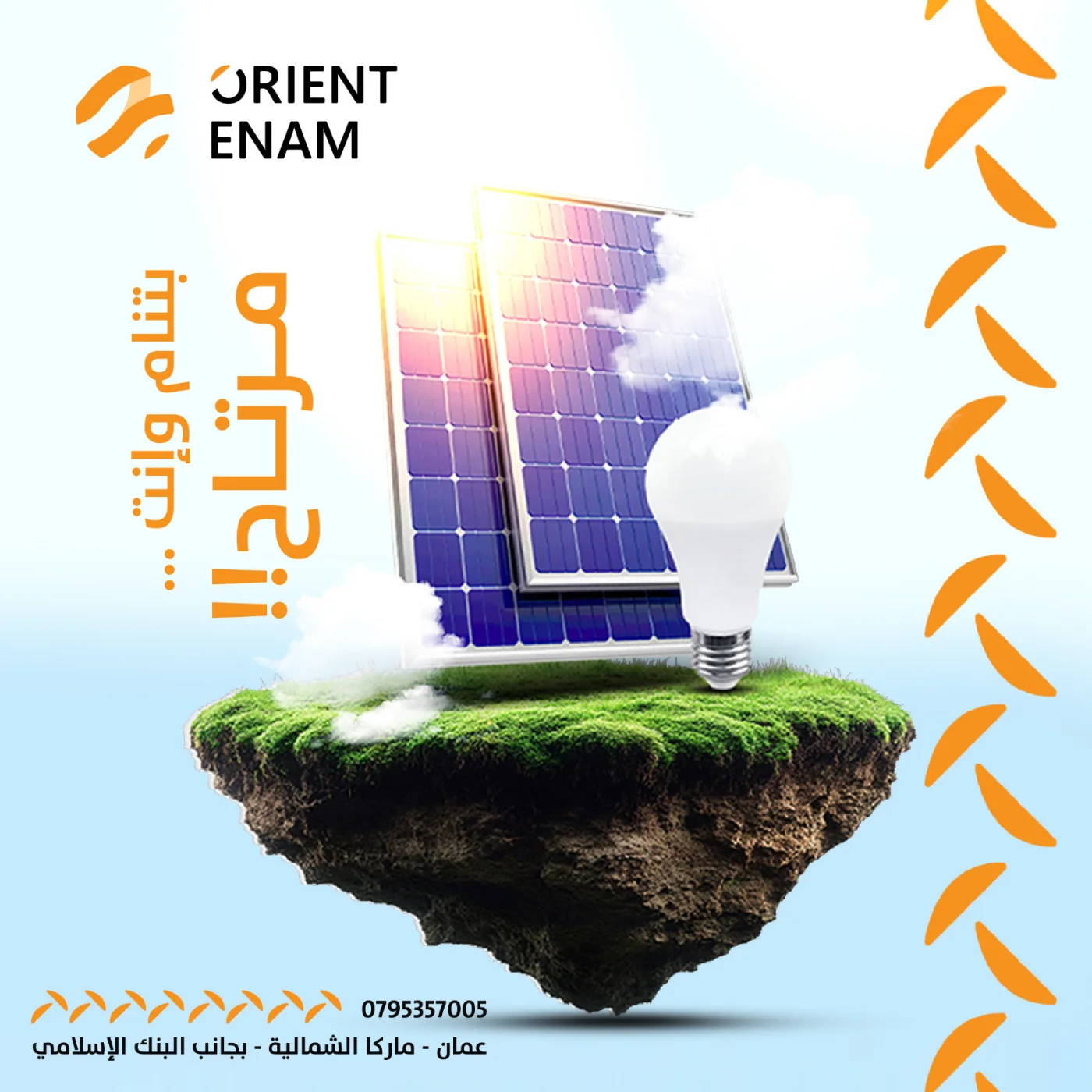
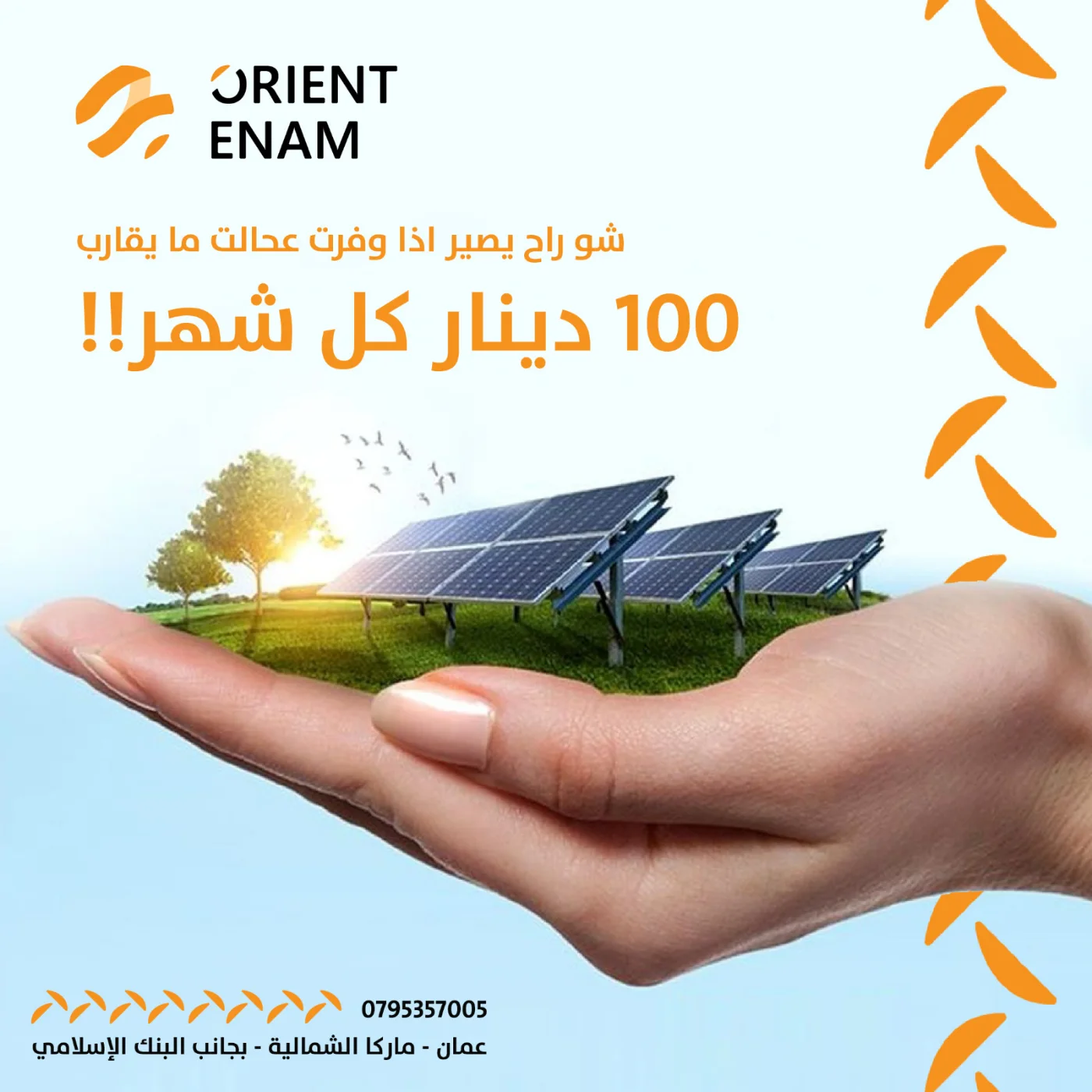
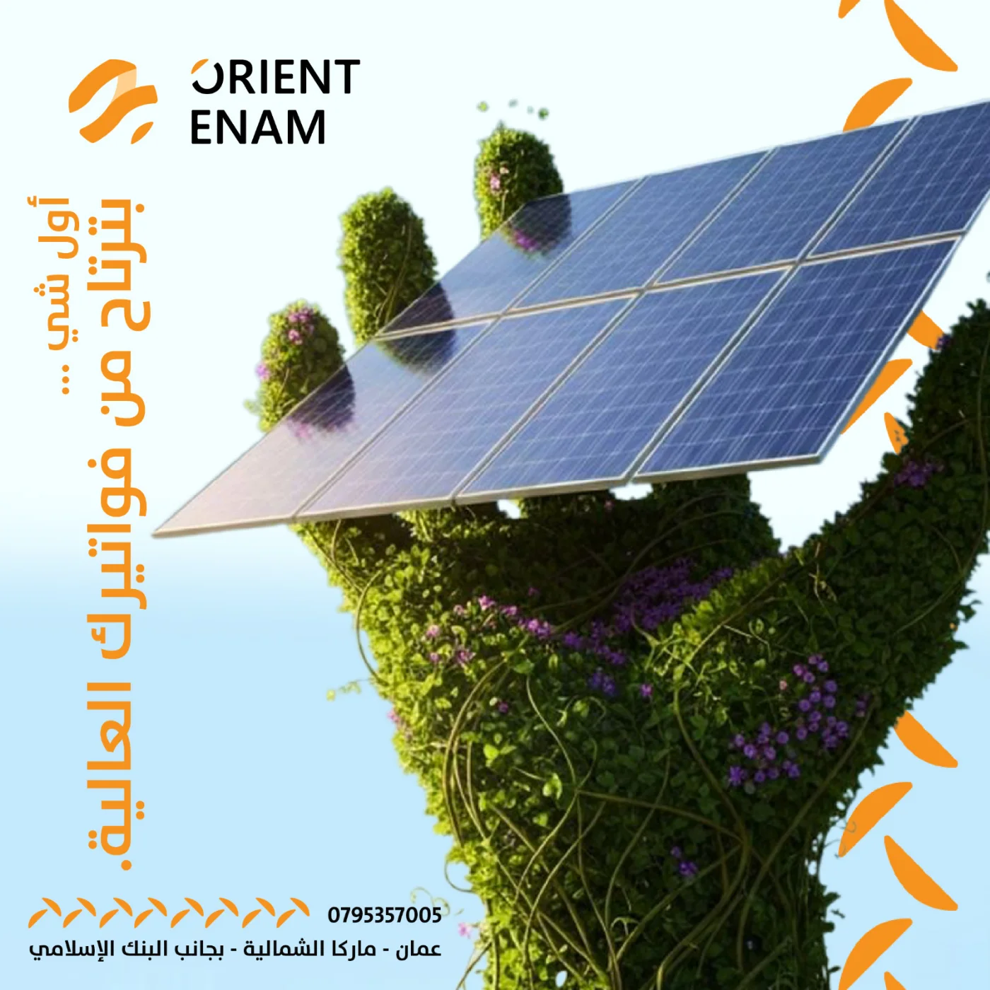
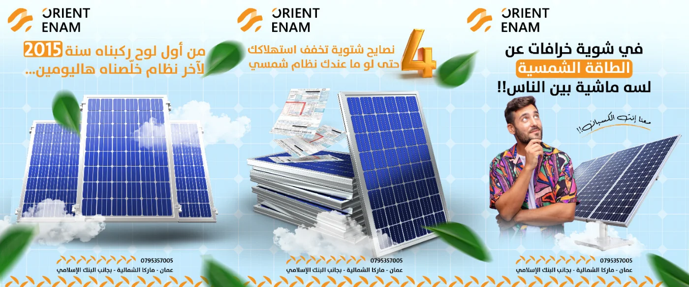
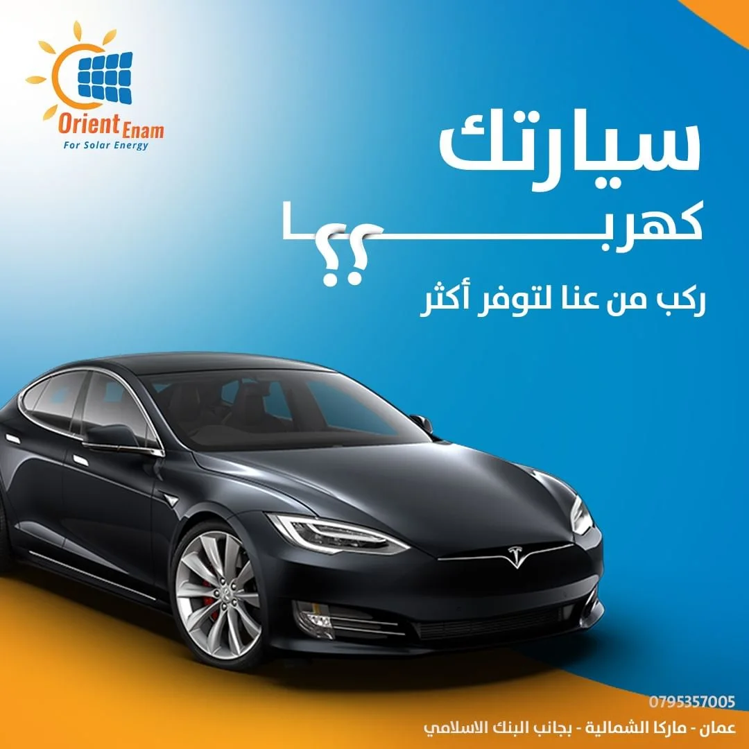
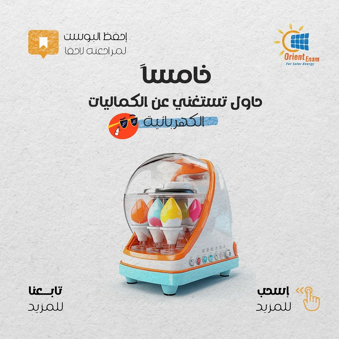
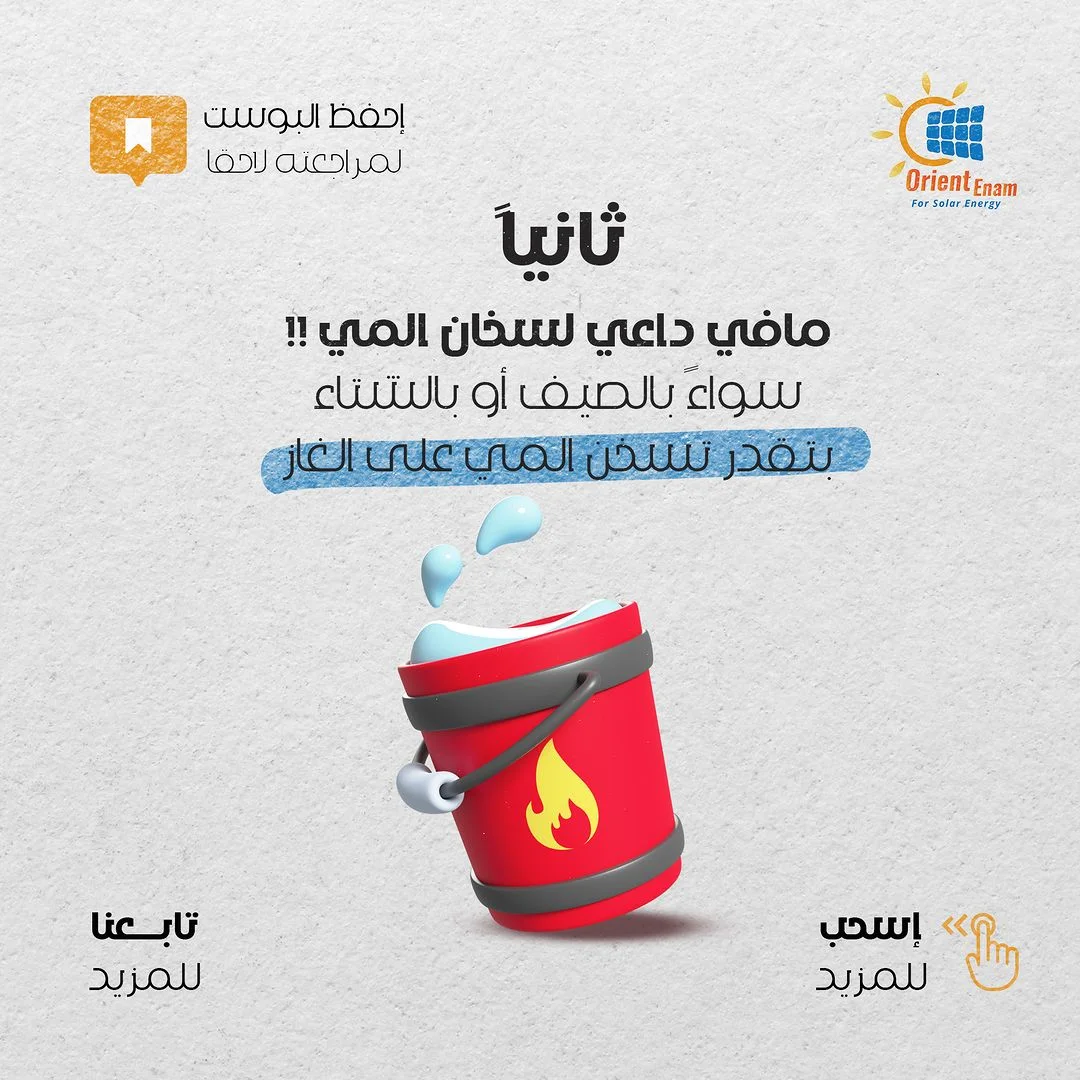
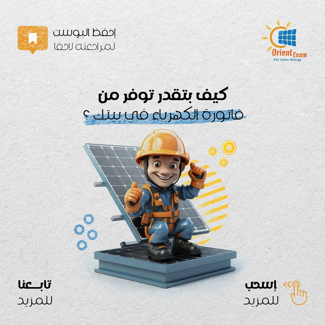
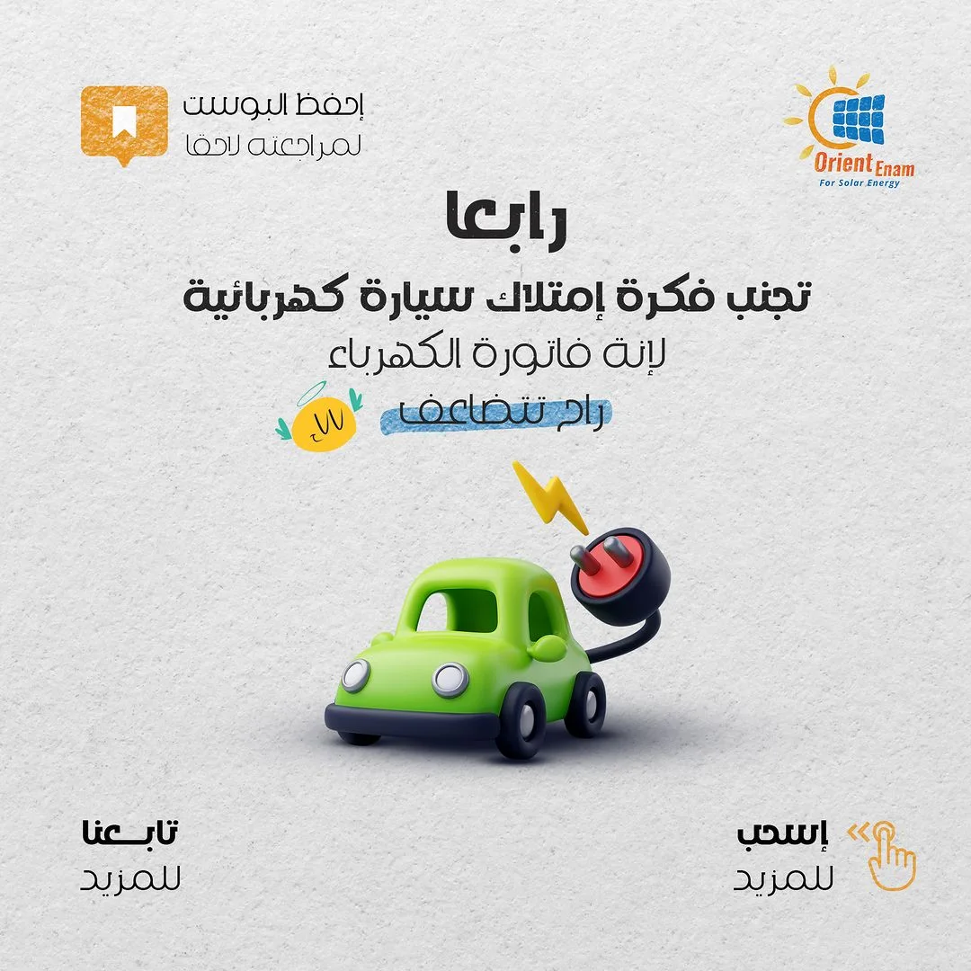
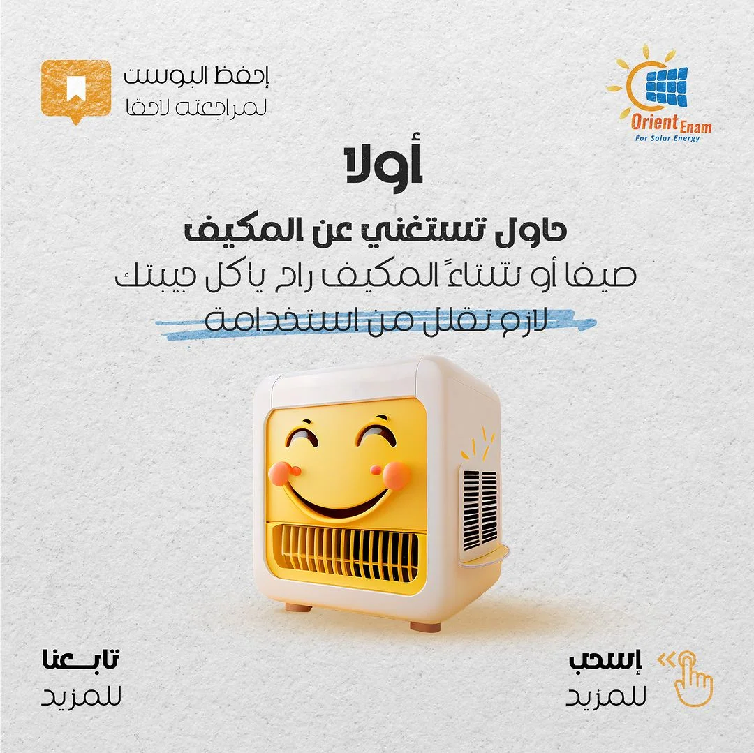
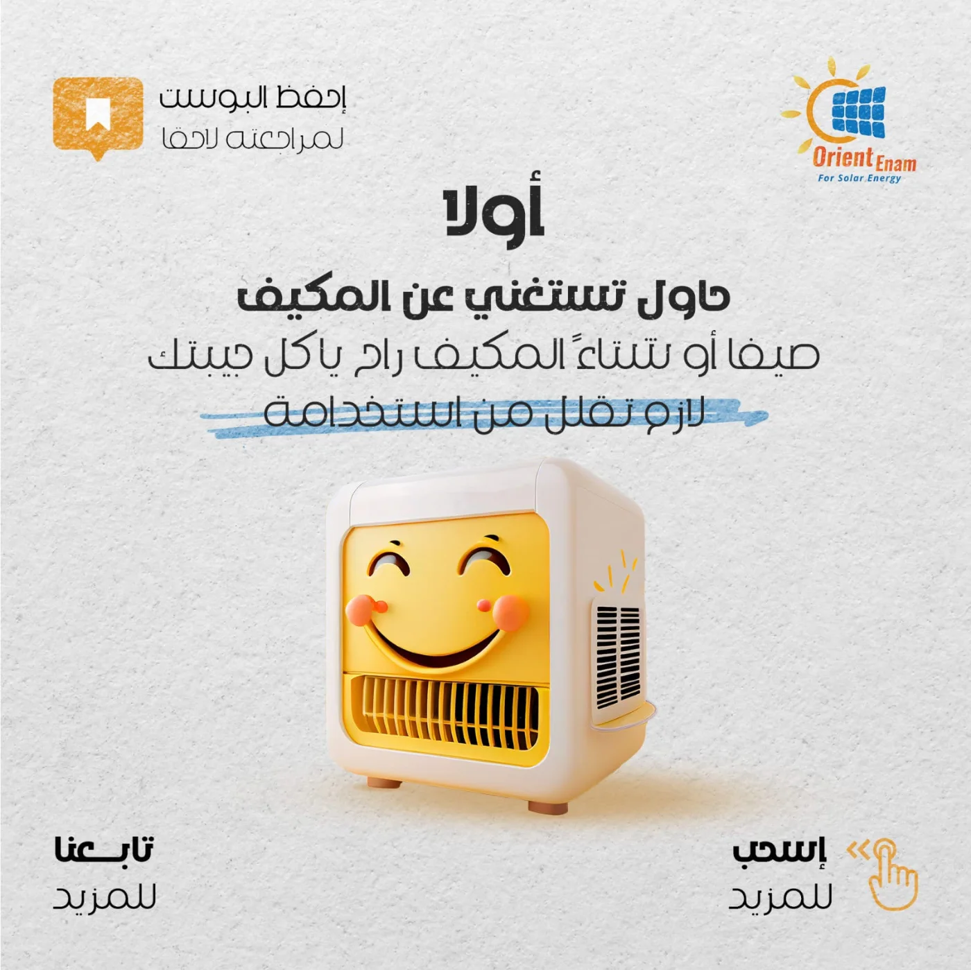
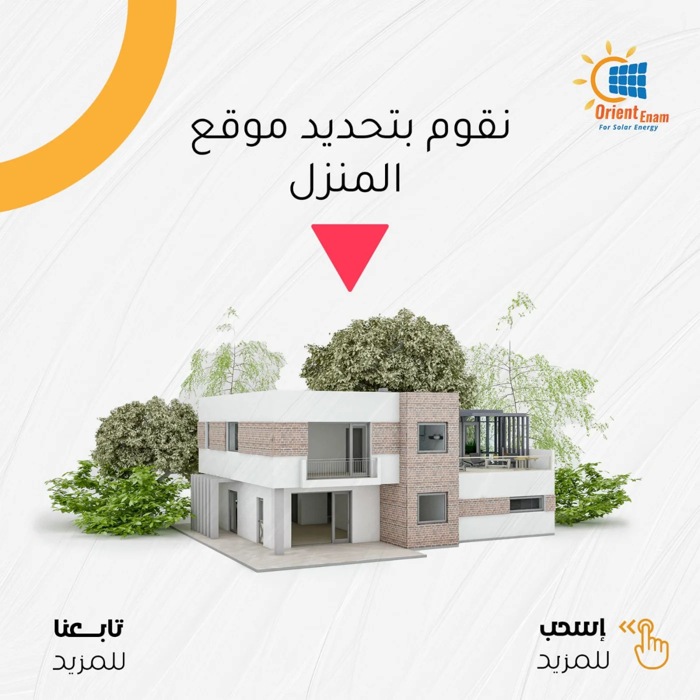
Two tracks at once. First, we rebuilt the identity from the logo up into a system that holds across every format and platform. Not a coloured logo and done. Second, and more important: instead of posting product shots, we collected the real questions and objections reaching the company from the market, and built an educational campaign that answered them one by one. "what do I gain in winter?", "the bill versus the system cost", "does it actually save me anything?".
Result
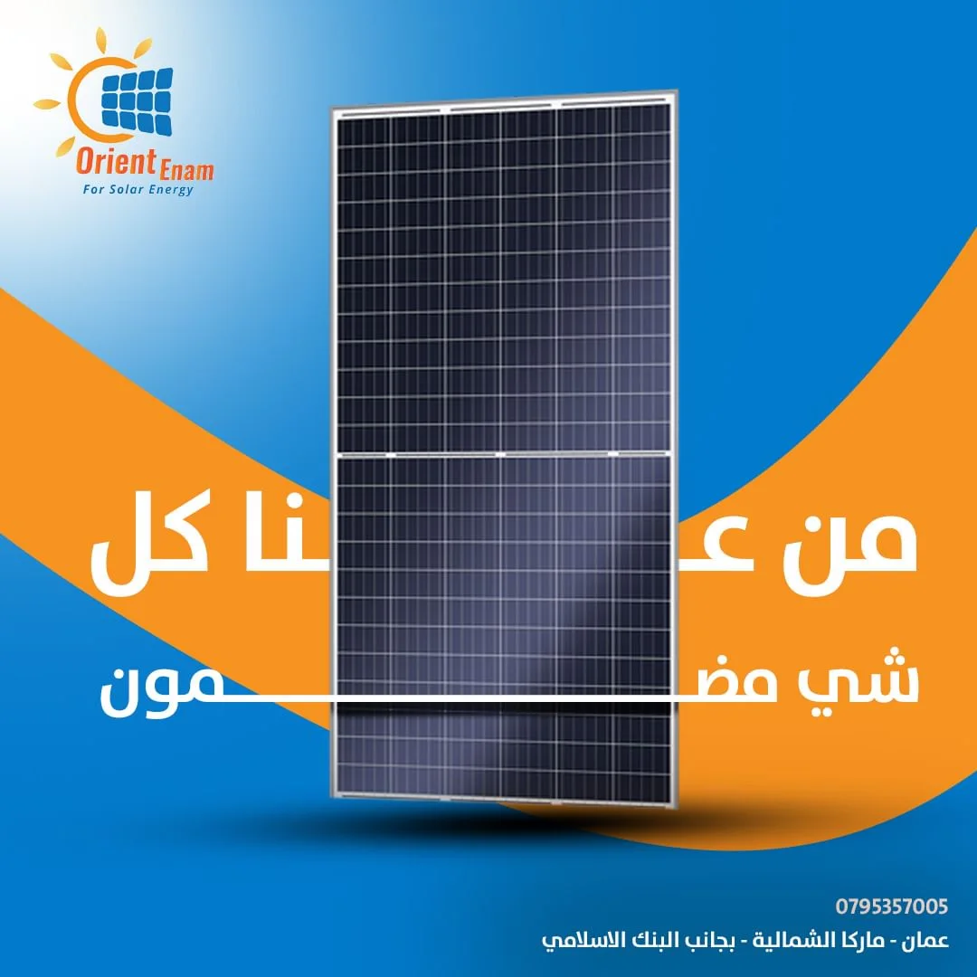
32 pieces in a single visual language, sequenced so that when they sit side by side on the profile they read as one continuous image. And the content stopped announcing. It started arguing. That is the difference between a page that posts and a page that sells.